 If you don’t have a clue about making a mobile-friendly website, or converting your already-established website into one, you have come to the right place!
Having a mobile-friendly website is a must for every blogger or website owner on this planet. It will significantly increase your traffic, thus you’ll have a better chance to thrive among your competitors.
Why Does Your Website has to be Mobile-friendly?
Since the great emergence of “the era of the smartphone”, many people prefer to access the internet through their mobile devices because, as they can do it anytime, anywhere.
Therefore, having a mobile-friendly website will automatically open a door to a bigger online audience. In fact, 70% of internet traffic today comes from mobile phones.
In addition, 51% of customers say that they use mobile devices to discover new brands and products. This number shows that optimizing a mobile-friendly site is just as good as expanding your business to a whole new level.
Moreover, 89% of people are likely to recommend a brand after a positive mobile experience.
Another factor that is worth mentioning – Google has updated the website rating system to provide better search results for mobile users.
In other words, if your website does not have excellent mobile optimization, it might be excluded from Google’s mobile search results or ranked lower on SERP.
The Importance of Responsive Website
Getting a nice mobile-friendly website starts by creating a responsive website.
A “responsive website” is a site that is able to respond optimally when a user accesses the page using mobile devices. In other words, this website will look and function well, no matter what kind of device is accessing it.
Here are some advantages of having a responsive website:
1. Better SEO
Responsive site design uses the same URL and HTML regardless of the device used to access the page. This setting allows Google to explore, index, and manage the site’s content more easily and efficiently. As a result, your website will have better SEO quality!
2. No Need to Create a New Site Design
Responsive websites do not need a new look or design for mobile devices. In other words, the display of your website will remain the same even though it is accessed from several different types of devices.
Without having to create two website designs, you could save a lot of time and energy.
3. Easier to Manage and Cost Effective
A responsive website is easy to manage and develop. All updates you make will appear on every device that accesses the website, there is no difference of the content which appears both on PC, laptop, or smartphones.
Moreover, the operational costs of a responsive website are more efficient since you do not need to develop websites on PC and mobile devices separately.
7 Tips on How to Make Your Website Mobile-friendly
First of all, you need to understand that making a mobile-friendly website requires a bit of technical knowledge.
While we appreciate your curiosity and desire to learn new things, optimizing a website for mobile devices can be quite overwhelming for a beginner. Therefore, it might be better to hire a website developer to help you do this task.
That being said, here are the seven tips to make your site mobile-friendly:
1. Start With a Mobile-first Approach
Most people start developing a website for a big screen device, such as a PC or laptop. While it is not wrong, this method would cause some trouble when you try to optimize the site for mobile users.
The best way to do it is by starting from mobile design. Try creating a beautiful, fully-functioning website for mobile users first, then work your way up to the bigger screen.
Optimizing smaller screen, such as a smartphone or a tablet is harder than the bigger screen. Therefore, it would be wiser to start from there.
2. Converting Your Desktop Site to Mobile
In case you already have a fully-functioning desktop site that has not yet been optimized for mobile use, the first thing you need to do is convert it to mobile.
Luckily, there are at least two very good methods to do this: converting your site using an online service, or using CMS plugins.
Converting Your Desktop Site With Online Site Converter
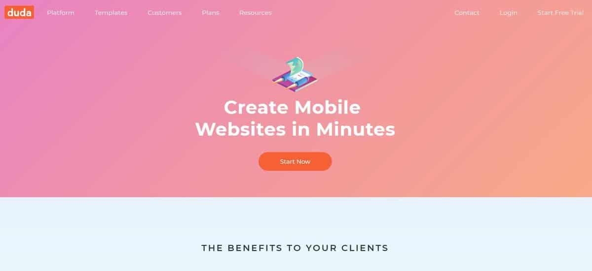
First, you can use an online site converter. Two of the most popular online site converters that you can use: bMobilized and Duda Mobile.
bMobilized offers an instant conversion with automatic image and content adjustment. The company claimed that the conversion result will support more than 13000 mobile devices from various brands.
You need to pay $19.99 per month to use their service. Aside from converting your desktop site, bMobilized also provides professional support for developers. Another great online converter to use is Duda Mobile. This website builder focuses on creating fully-functioning, mobile-friendly websites.
Another great online converter to use is Duda Mobile. This website builder focuses on creating fully-functioning, mobile-friendly websites.
This website builder can be used for free. However, you need to pay a subscription fee for $19 per month if you intend to use some of its premium features, such as email support, custom domains, or backup services.
Moreover, Duda Mobile also offers a set of advanced features to help users develop a mobile-friendly e-commerce site with multilingual support. However, you need to pay $22 to $46 per month to use these amazing features.
Converting Your Website Using CMS Plugin
The second option to convert your desktop site into a mobile-friendly website is by using a plugin. Nonetheless, this method will work better for the CMS users that have already owned a Joomla, Drupal, or WordPress a site.
As for Joomla users, Responsivizer and JoomlaShine should do the trick.
Meanwhile, if you use Drupal, ThemeKey and MobileTheme are the ones we recommend for you.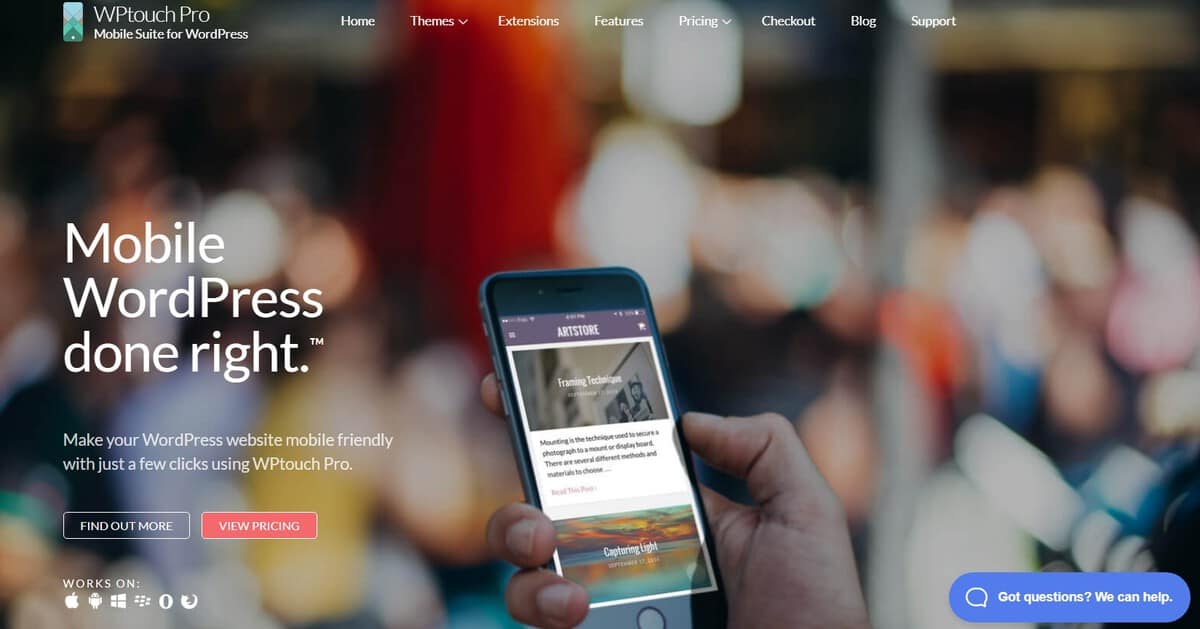 However, keep in mind that some of these plugins are not available for free. You need to pay a subscription fee to use it. For instance, you may need to pay up to $359 per year to use the WPtouch pro Enterprise plan.
However, keep in mind that some of these plugins are not available for free. You need to pay a subscription fee to use it. For instance, you may need to pay up to $359 per year to use the WPtouch pro Enterprise plan.3. Use a Responsive Theme
Responsive design will automatically make your website mobile-friendly. You will have a website that shows similar and consistent content with the desktop version.
Currently, there are a lot of responsive WordPress themes that you can try. Many of them are not available for free, but they do perform really well.
One of the fastest, most responsive themes in WordPress is Avada. This theme can load your website in less than a second which is perfect if you want to make a mobile-friendly website.
To prove that a theme is responsive and quick to load, we recommend you to use Pingdom.
Pingdom is the best tool to provide comprehensive data about your website’s speed. All you need to do is copy your website link, then paste it into the URL column. Choose where do you want to start your website test, and hit the Start Test button.
Pingdom will show your website’s grade (based on its overall performance), load time, and many other important elements.
It will also give some notes on how to improve speed.
Here is the test result of Avada home portfolio style (it is a live demo).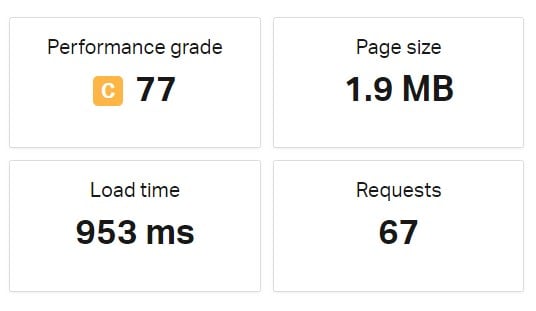 As you can see, Avada scores a staggering 953 milliseconds to load the website.
As you can see, Avada scores a staggering 953 milliseconds to load the website.4. Never Use Flash
A lot of web developers have “abandoned” Flash because it uses too many hardware resources that can lead to slower page response and loading time.
In addition, Flash can also hurt your SEO quality.
Moreover, neither Android nor iOS supports Flash, so using this particular software is not the best decision if you want to make a mobile-friendly website.
5. Maintain Your Site’s Speed
The speed of a website is heavily influenced by the quality of the server and hosting that you use. Therefore, you need to use a hosting that is fast and reliable if you want to make a mobile-friendly website.
We recommend you to use Cloud or VPS hosting for better performance. It offers the best server response speed which is the most influential thing that affects your site’s loading speed. Another thing that you need to do to optimize your site’s speed is limiting the number of content that needs an additional plugin to run.
Another thing that you need to do to optimize your site’s speed is limiting the number of content that needs an additional plugin to run.
Furthermore, you also need to optimize your homepage to speed your site up. Here are some tips to ensure your homepage is not slowing your website down:
- Reduce the number of posts on the front page (limit it between 5-10 posts).
- Remove unnecessary widgets.
- Remove unnecessary, inactive, or irrelevant plugins.
- Keep it clean and tidy.
In the end, we strongly believe that a clean, well-optimized homepage will make your site not only looks good but also load faster!
6. Pay Attention to Your Site’s Appearance
The first fifteen seconds are defining moments for users to decide whether to stay or leave a website. Therefore, you need to make a good impression as quickly as possible to instill a positive image of your website.
While the content is what draws more visitors, your site’s appearance is what will make them stay for longer than 15 seconds.
Make sure that you have turned off the autocorrect form in your login page (filling out web forms in the mobile device is often problematic), use large buttons and font size, and redesign your popups (if there is any) to make it mobile-friendly.
You can use the mobile-friendly test tool to check whether your site has already been optimized for the mobile device or not.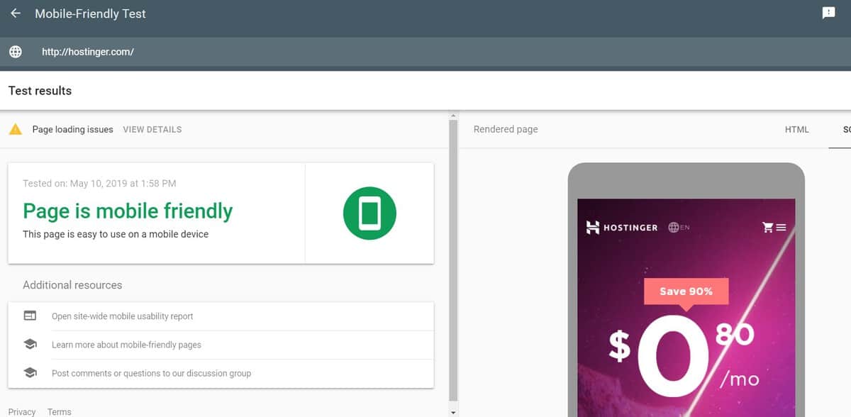
7. Enable Accelerated Mobile Pages (AMP)
Accelerated Mobile Pages (AMP) is one of Google projects that aims to speed up websites’ loading process using compressed data which is eight times smaller than the usual mobile page size. This technology claims to boost your site’s speed up to four times which in return will make it more mobile-friendly.
AMP has been widely used by numerous flagship companies, including Twitter, New York Times, and Adobe. Here are the reasons why it is popular:
It Accelerates The Site’s Loading Time in Mobile Devices
According to Google, about 53% of mobile users will leave a website that takes more than 3 seconds to load.
Luckily, fast loading is the main benefit of AMP. Using this technology will increase the site’s speed so you won’t lose that precious organic traffic.
It Improves Your SIte’s Visibility among Users
Google will display an AMP website with a lightning sign symbol on mobile search, it is intended to allow users to distinguish between AMP-powered sites and non-AMP sites.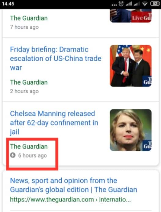 The AMP symbol on search results can actually have a positive impact and give you a big advantage. Your website will stand out since a lot of users always search for sites with AMP symbol to save their time (it loads faster!)
The AMP symbol on search results can actually have a positive impact and give you a big advantage. Your website will stand out since a lot of users always search for sites with AMP symbol to save their time (it loads faster!)It Uses Google AMP Cache to Improve Your Server’s Performance
Google AMP Cache is a proxy-based content delivery network (CDN) that is used to facilitate the transfer process from valid AMP documents to users.
In simpler words, Google AMP Cache will keep your site’s data. This method allows your site to load quicker which will make it more mobile-friendly.
Here are some features of Google AMP Cache improve that can improve your server performance:
- It can save images and font data
- It automatically limits the maximum dimensions of the image
- It will convert image formats into smaller ones for mobile devices
- It is able to lower images’ quality to speed up the loading process
- It uses secure channels (HTTPS) and the latest web protocol technology (SPDY, HTTP/2).
Conclusion
Pursuing success online means that you need to adapt to the latest trends in technology. Considering how big the number of mobile users, it might be wiser to put the mobile optimization as your current priority.
To sum it all up, here are the best ways to make your website mobile-friendly:
- Always build your website with the mobile-first approach.
- Convert your desktop site into a mobile-friendly one using online services, such as bMobilized and Duda Mobile, or use a mobile-optimization plugin for your CMS.
- Use a responsive theme on your site and test it with Pingdom to check its performance.
- Do not use Flash!
- Make sure that your website’s speed is maintained well by using a fast, reliable web hosting service.
- Make sure that your site’s appearance is well designed.
- Try using Accelerated Mobile Pages (AMP) to improve the website’s performance in mobile devices.
Finally, optimizing your site for mobile devices takes quite a lot of effort. Nonetheless, we strongly believe that all that hassle will not be a waste of your time.
In fact, by applying the tips above, we believe your website will have a greater chance to thrive and produce better organic traffic in the future. Good luck!


0 Comments
Thanks for comment.